Every Other Day
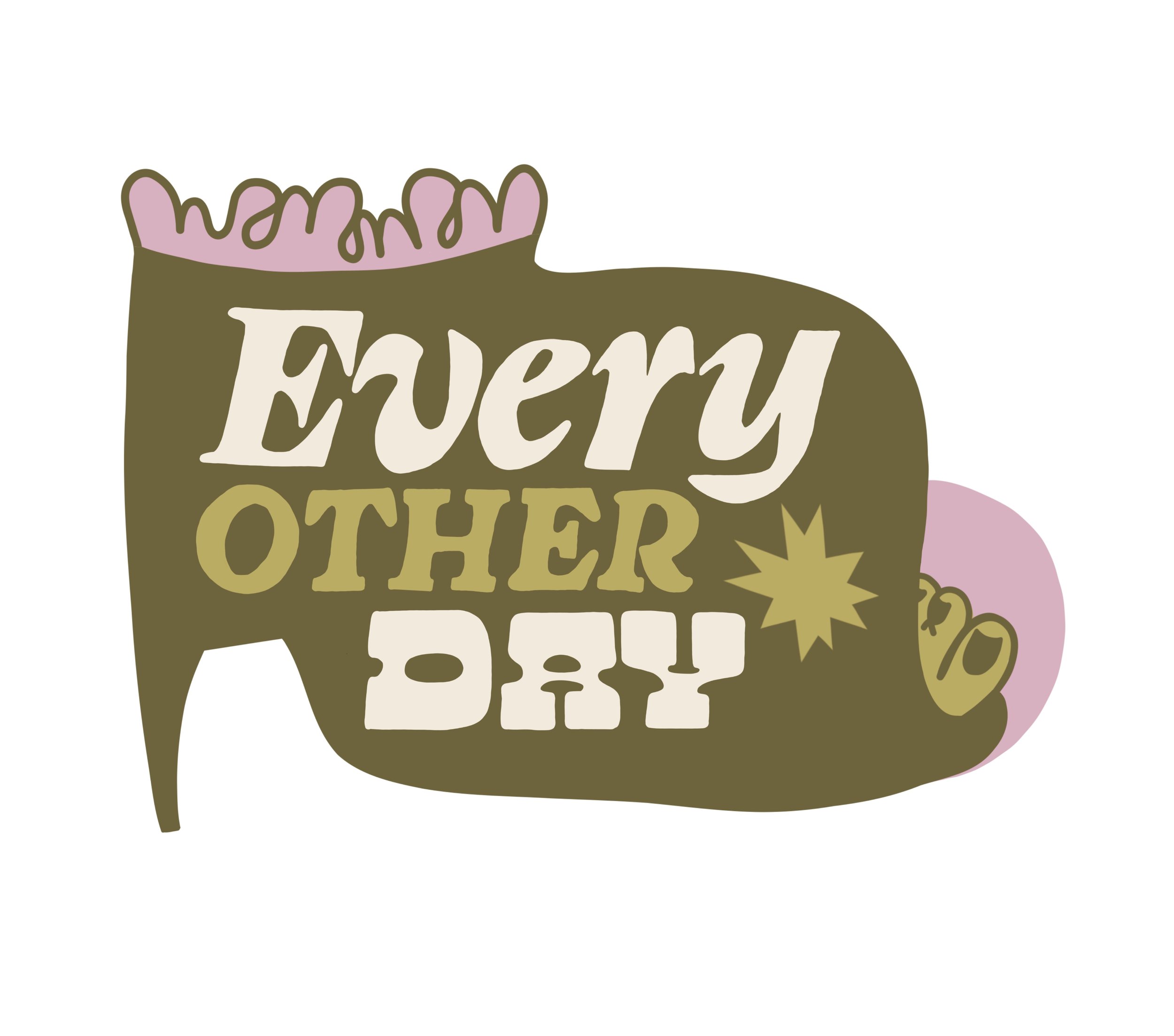
Milwaukee-based vintage seller Every Other Day asked for something inspired by “sapphic, ceramic, clay and earth, opulence, and rotting at home.” I built out a branding package, including a custom color palette, price tag stamps, and a variety of simple logos to use depending on the season.
Milwaukee Trans & Queer Depot
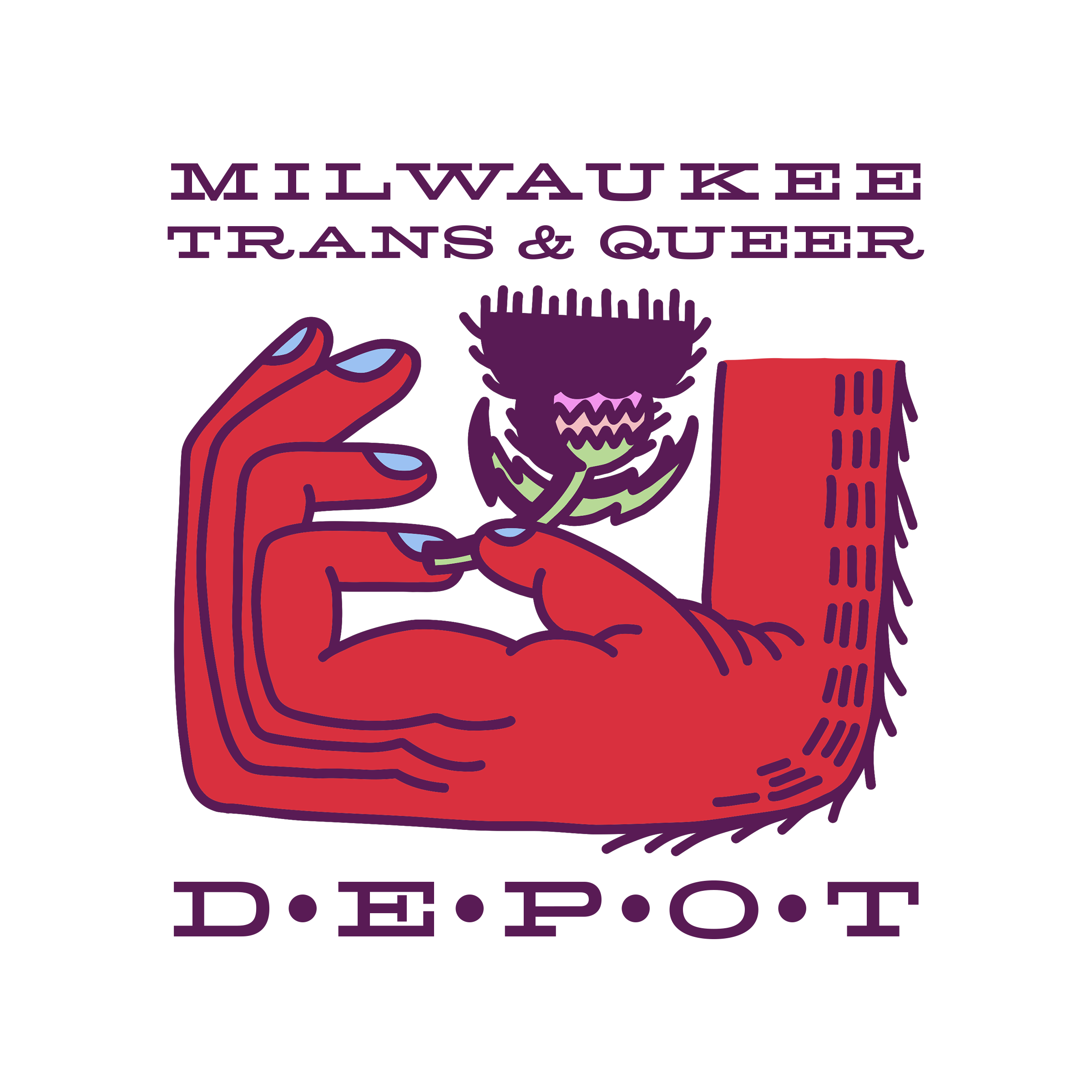
This organization of health care providers and activists wanted a logo that represented the resilience of LGBTQ+ Milwaukeeans in a “punk” take on the Transgender pride flag colors. I chose to include a thistle for its beauty, its sharpness, and its ability to grow in even the hardest conditions.
Mr. Milwaukee Leather Competition
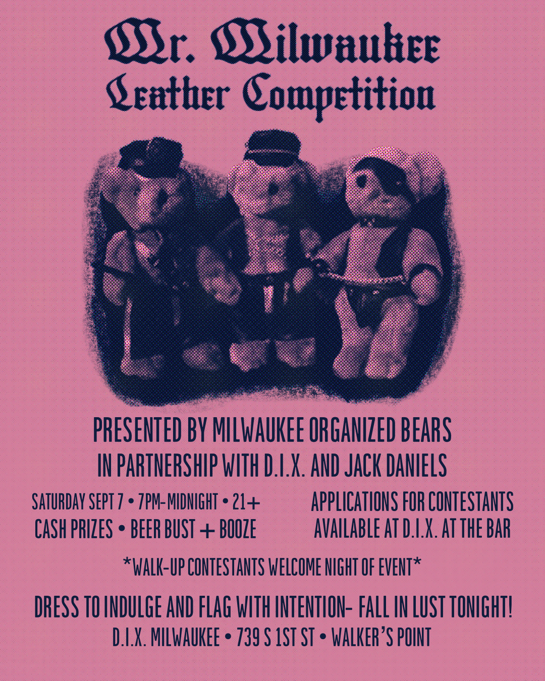
2024 marked the first year in history that Milwaukee became an officially Mr. Leather-certified city to compete in the Mr. International Leather competition. I used vintage gay magazines as inspiration for font inspiration and recreated a newspaper print look for extra texture.
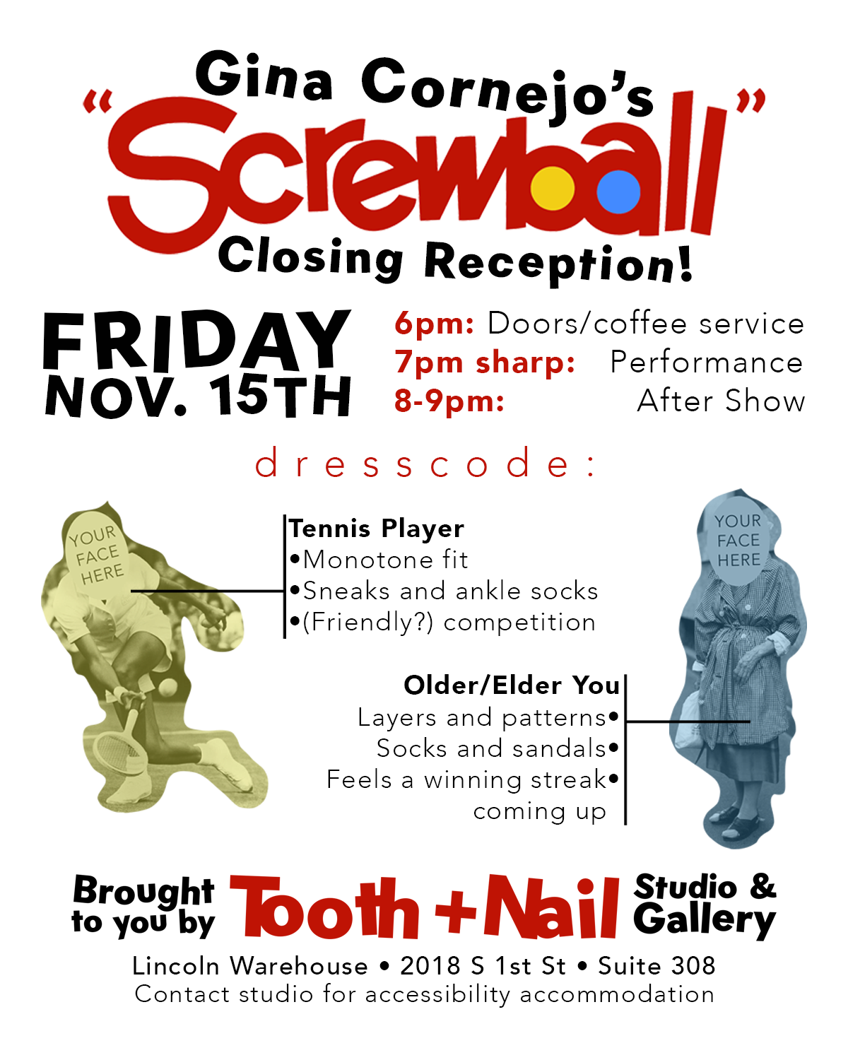
Tooth + Nail Studios event fliers
Opening in February 2024, Tooth + Nail Studios and Gallery became a beloved Queer art space in Milwaukee, WI. I worked with selected artists to promote their shows and workshops in the style of their choice. Here you see that Gina Cornejo wanted the title of her show “Screwball” to mimic the ice cream treat of the same name. This flier highlights the recommended dress code for her closing night event.
One Trick Pony
A quarterly vending event in Milwaukee, WI asked for a vintage inspired flier. I used colors taken from 1940s hand painted carnival signs as a guide to develope this design.
Take Care Baking
Small bakery in Portland, OR. Inspired by the client’s love of Elvis, cowboy boots, and vintage chainstitch designs. Client asked for two logos, banners, and multiple backgrounds for social media marketing. Project included a custom color palette for a visually consistent presence.
Better The Devil
Design for a Portland, OR hotdog pop up restaurant. Client gave me freedom to do what I pleased.
Henhouse Brewing
Label design for Henhouse’s Art Forward project. Designers from California’s North Bay were asked to design labels to bring vibrant art to the community during the first year of the pandemic. Inspired by a request by the marketing department for bright and bold colors.
A Little Luster
Logo for a Santa Rosa, CA baker who asked for a design based on classic tattoos, edible flowers, and vintage motorcycle ads. Client asked for simple and strong lines in order to translate well as a rubber stamp design.
